Forms
Forms are one of the most important elements of digital experiences because they are interactive and allow people to enter information. It's important to make sure that they are accessible.
What’s the best way to give someone feedback after they submit a form?
Notifications are key for helping people understand both what went right and what needs fixing. Here are three simple tips:
- Keep messages clear and concise. Avoid technical jargon or vague wording.
- Use visual cues. Icons or changes in stroke thickness can help differentiate notifications from other text.
- Place error messages where users will see them. If your form is at the bottom of the page, don’t put the error message only at the top.
Avoid using form submission notifications that disappear automatically—if a user misses them, they’re left unsure what happened.
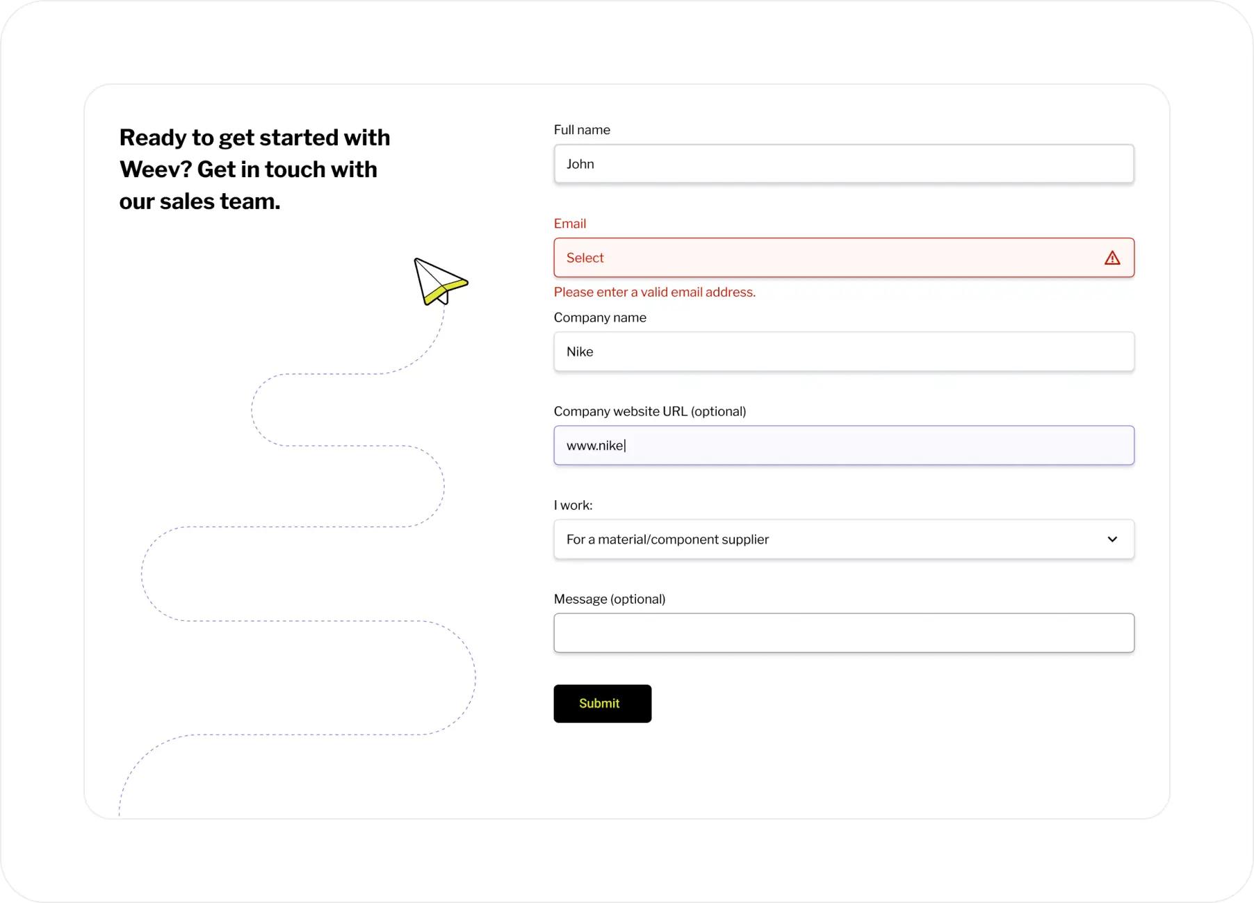
Example
This is an example of a form we designed for Weev which shows an error state when a required field is left empty.
When is it better to divide a form into multiple screens?
We recommend splitting a form into multiple steps if a single screen requires more than two scrolls. Research shows that people are more likely to complete forms when each step feels short and manageable.
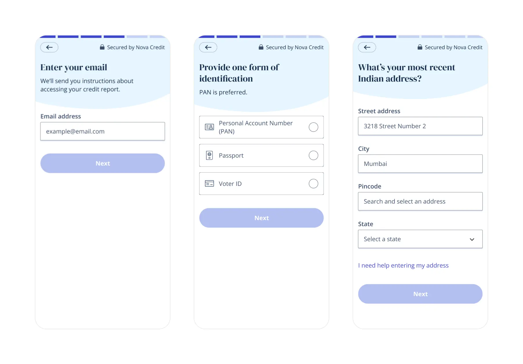
Example
We designed this multi-step form for NovaCredit where the steps require minimal scrolling.
Can you hide information about how to fill out a form in an info icon?
If the information is essential, you should not hide it. If you’re not sure if it's essential, test your form with real users.
Here’s how to test it:
- Test with at least five people, including people with disabilities.
- Keep the info icon on the form, but make it non-clickable.
Then, evaluate:
- If people complete the form without trying to click the icon, it’s likely okay to keep the info hidden.
- If people complete the form but many try to click the icon, consider exposing the information.
- If people make mistakes or can’t complete the form, the info should definitely be visible.
What is the best way to design a progress indicator if the number of steps in the form changes?
If the number of steps may change, avoid using numbers. You could create a false sense of progress, leading someone to think they’re almost done—only for more steps to appear. Shifting expectations like this can lead to frustration.
Using a progress bar with a clear visual cue—like a filled section and label—helps users track their progress and stay engaged, reinforcing a sense of momentum without overpromising completion.
Good
When the number of steps on a form changes, it is best to use a progress bar that does not have numbers.

Bad
Step indicators are a great solution in most cases. However, when the number of steps changes, we do not recommend them.

How much spacing should there be between checkboxes or other form inputs?
WCAG does not define guidelines for minimum spacing between touch targets (such as checkboxes). Instead, it only specifies the minimum size of those touch targets — 24px for WCAG AA, or 44px for WCAG AAA.
We recommend at least 8px of spacing between touch targets. This amount of spacing is important to prevent people from selecting an adjacent item by mistake.
Does a checkbox really have to be square?
Yes, they really do. Checkboxes let people select several options from a list, whereas radio buttons only let you select one option. Because people are used to this, it can confuse them if they see another shape.